
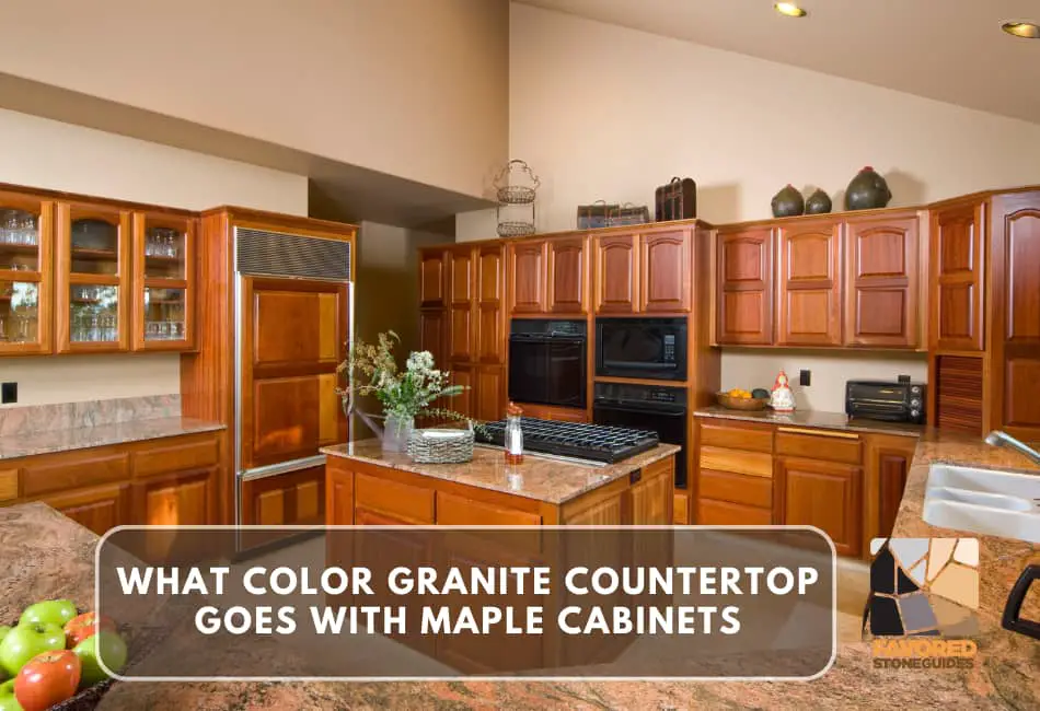
Choosing the perfect granite countertop color to complement your maple cabinets might seem daunting, but it’s a decision that can significantly enhance the aesthetic appeal of your kitchen.
The right countertop color can accentuate the beauty of your maple cabinets and tie the entire room together, creating a harmonious and inviting environment.
This guide will explore different granite countertop colors that beautifully pair with maple cabinets.
We’ll delve into specifics of color theory, how various hues interact with the warm tones of maple, and provide real-world examples to inspire your next kitchen remodel.
So, whether you’re renovating your kitchen or daydreaming about future possibilities, this guide is here to assist you.
Understanding Maple Cabinets
Let’s dive into a deeper understanding of maple cabinets, their inherent characteristics, and how they inherently affect the aesthetics of your kitchen.
We’ll also discuss some considerations for countertop pairing, ensuring you make an educated choice regarding your kitchen remodel.
Characteristics of Maple Wood
In my experience, Maple is an exceptional choice for cabinetry due to its durability and appealing grain pattern.
It’s hardwood, which means it can withstand the hustle and bustle of a busy kitchen.
When I had my first house, the kitchen was fitted with maple cabinets, and they stood the test of time even with three boisterous children!
How Maple Cabinets Can Affect Your Kitchen’s Aesthetics
The warm tones of maple cabinets can make your kitchen feel cozy and inviting.
It’s a versatile wood that lends well to traditional and contemporary styles.
I fondly recall how my maple cabinets gave the kitchen a rich, warm glow, especially under the morning sunlight.
They have a way of making a kitchen feel like the heart of a home.
Considerations for Countertop Pairing
When choosing a countertop to pair with your maple cabinets, you should consider the color and style of the rest of your kitchen.
Maple cabinets have a warm tone, so countertops in more excellent colors, like blue-grey or dark green granite, can create a nice contrast.
In my past kitchen remodels, I’ve found that lighter-colored countertops can give the room a clean, airy feel, while darker colors add elegance and sophistication.
Remember, it’s all about balance and harmony – the right countertop should accentuate your cabinets and flow with the rest of your kitchen decor.
Popular Granite Countertop Colors
When choosing a granite countertop color, the options can truly feel overwhelming.
But don’t worry, I’m here to guide you through some of the most popular options and discuss their pros and cons.
Remember, the best color should complement your maple cabinets and match your kitchen decor.
1. Absolute Black Granite
As the name suggests, Absolute Black Granite is a deep, rich black color.
It’s a statement piece for any kitchen. I once had a client who paired this with her maple cabinets, and the contrast it created was stunning.
It gave the room a modern, luxurious feel. However, like a black car, it shows every speck of dust and every fingerprint.
2. River White Granite
River White Granite is a lovely choice to keep your kitchen light and airy.
The white is offset with subtle grey and lavender veins, giving it a unique look.
When I used this in my kitchen remodel, it made the room feel larger and more open.
That said, lighter colors might show stains more easily than darker ones.
3. Baltic Brown Granite
Baltic Brown Granite mixes brown, tan, and rose hues. It’s a warm, earthy choice that complements maple cabinets beautifully.
A friend of mine chose this granite for her rustic-style kitchen, and it fit in perfectly. However, its busy pattern may not be everyone’s cup of tea.
4. Blue Pearl Granite
Lastly, Blue Pearl Granite is a sophisticated option with its stunning, reflective blue and gray specks.
I used this in a client’s navy-themed kitchen once, and the result was truly breathtaking.
But remember, the dark color and unique pattern might not be as versatile if you decide to change your kitchen’s color scheme down the road.
Remember, there’s no right or wrong choice here, just the one that makes you smile every time you step into your kitchen.
After all, your kitchen is the heart of your home, and it should reflect your personal style and taste.
Complementary Color Schemes
Matching and Contrasting
Color is a powerful tool in kitchen design. It’s not just about aesthetics; it’s also about creating a space that feels welcoming and reflects your personality.
When choosing a color scheme for your kitchen, especially with maple cabinets, it’s crucial to consider matching and contrasting.
Matching or choosing similar tones can create a harmonious, unified look. On the other hand, contrasting or using different colors can add interest and depth, making your kitchen more visually appealing.
Let me share a quick story. One of my clients was a passionate home cook who loved vibrant colors. She had maple cabinets and wanted her kitchen to reflect her lively personality.
We chose a bold, red backsplash to contrast with the cabinets, and it instantly made the kitchen pop! It was an excellent illustration of the power of contrast.
Color Schemes for Maple Cabinets
When it comes to pairing colors with maple cabinets, the possibilities are endless. You could go for a warm, cozy look with rich, earthy tones like browns and yellows.
Alternatively, pair your cabinets with cool blues and grays for a more modern feel. For example, I remember helping a friend renovate her kitchen.
She had gorgeous maple cabinets, and we decided to pair them with a cool gray countertop and blue accents throughout the room. The result was a chic, contemporary kitchen that she loved.
Creating Harmony in Your Kitchen
Harmony in your kitchen is all about balance. It’s about blending colors, textures, and patterns in a way that feels cohesive and pleasing to the eye.
Remember, your kitchen is more than just a place to cook; it’s a space where you and your family gather, so it should feel comfortable and inviting.
Once, I worked with a couple who had differing tastes – he preferred a traditional style, while she leaned towards contemporary.
They loved their maple cabinets but struggled to agree on a color scheme that would meet their preferences.
We blended both styles, opting for a neutral color palette with modern and classic elements.
In the end, they had a kitchen that felt harmonious and reflected both of their styles. It was a great reminder that balance is vital in creating a harmonious kitchen.
Factors to Consider
Kitchen Size and Lighting
When picking color schemes for your kitchen, the size of the room and the amount of natural light it receives are crucial aspects to consider.
In my experience, smaller kitchens can feel cramped with dark or intense colors. I once helped a client with a quaint, small kitchen who loved the color black.
To balance his preference and the kitchen’s size, we chose a lighter shade of grey for the walls and incorporated black in the details.
The result was a kitchen that retained an airy, spacious feel while still reflecting his personal style.
Personal Style and Preferences
Your personal style and preferences are key in deciding the color scheme of your kitchen. In a project I did last year, my client was an avid nature lover.
We chose to mirror this in their kitchen by using earthy tones like greens and browns, with touches of floral patterns.
It’s important to remember that your kitchen is an extension of you and should reflect your personal aesthetic.
Durability and Maintenance
The durability and maintenance of the materials you choose are equally important. I’ll never forget a project where the clients opted for a beautiful white marble countertop.
It looked stunning, but they quickly realized it stained easily and required more maintenance than expected.
When choosing materials for your kitchen, it’s essential to consider their durability and the level of maintenance you’re willing to commit to.
Step-by-Step Selection Process
Start with Cabinet Finish Assessment
In designing a kitchen, I always recommend assessing the cabinet finish.
In one of my recent projects, my clients deeply loved their mahogany cabinets and were keen on highlighting their rich tone.
By assessing the cabinet finish first, we could select complementary colors for the rest of the kitchen that truly brought out the beauty of the mahogany.
Narrow Down Granite Color Choices
Next, narrow down your granite color choices. I remember a project where the client was overwhelmed with the vast array of granite colors.
I suggested she shortlist her choices based on the colors in her kitchen. We then chose a granite that matched the cabinet and wall colors, which resulted in a cohesive and visually appealing design.
Test Samples in Your Kitchen
Finally, always test samples in your kitchen.
Lighting can dramatically alter colors; what looks good in a showroom may not work in your kitchen.
This lesson was learned in one of my early projects when the client chose a countertop sample that looked stunning under showroom lights.
However, under her kitchen’s lighting, the countertop appeared drastically different.
So, always take samples home and observe them under your kitchen’s lighting before deciding.